


What you need to know before creating a design
When creating graphic materials, it is important to understand the difference between the two main color models – RGB and CMYK. They have different purposes, work with different media, and affect the final result of your image. In this article, we’ll take a look at the difference between them and how to choose the right model for your needs.

What is RGB?
RGB (Red, Green, Blue) is a color model used for computer screens, smartphones, TVs, and other devices. It is based on three primary colors:
– Red
– Green
– Blue
RGB images are created using light. This means that the color is formed by superimposing these three components in different intensities. When all three colors are mixed at their maximum, we get white, and when they are missing, we get black.
When to use RGB?
RGB is suitable for digital materials such as:
– Websites and web design
– Social networks
– Electronic presentations
– Videos and animations
RGB delivers high brightness and color saturation, making it ideal for visuals on the screen.


What is CMYK?
CMYK (Cyan, Magenta, Yellow, Key/Black) is a color model used in the printing industry. It is based on four colors:
– Cyan
– Magenta
– Yellow
– Black (Key)
CMYK works on the principle of light absorption. Here, color is created by applying layers of paint to a white surface, such as paper. The more layers of paint, the darker the color becomes.
When to use CMYK?
CMYK is suitable for everything that is printed:
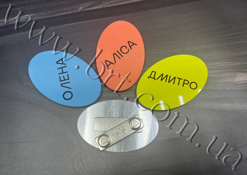
– Business cards and badges
– Booklets and catalogs
– POS products and stands
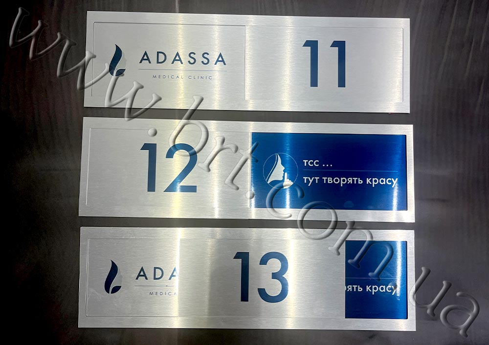
– Posters, signs, plaques
– Souvenirs and corporate gifts


The main difference between RGB and CMYK
1. Purpose
– RGB is used for digital screens.
– CMYK is for printing.
2. How it works
– RGB creates colors by emitting light.
– CMYK creates colors by absorbing light by inks.
3. Brightness of colors
– RGB produces brighter, more saturated colors because it works with light.
– CMYK may be less vivid, but provides realistic shades for printed materials.
4. Color conversion
– Images created in RGB may appear differently after printing if they are not converted to CMYK before they are sent to print.

How to achieve the perfect result?
1. Consider the materials and printing method. Different materials affect the final appearance of colors. For example:
• A gold or silver metal can add a different hue to an image.
• Glossy or matte material. The former can add brightness and shine, while the latter, on the contrary, can add natural texture and restraint.
• Transparent material may require an additional white layer of ink for greater brightness and expressiveness of the image.
• Sublimation inks penetrate the structure of the material, acquiring its properties.
• Ultraviolet (UV) inks remain on the surface as an additional layer. They cover the substrate, so the texture or gloss of the material is less visible.


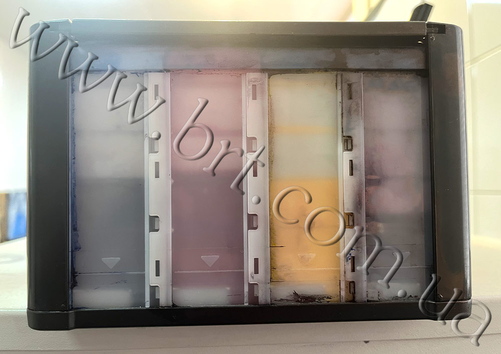
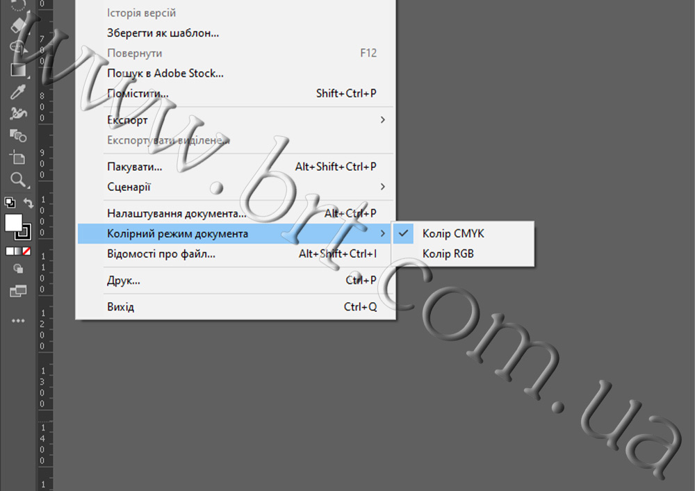
2. Convert colors in advance. If your layout was created in RGB, be sure to convert it to CMYK before printing. This will help avoid loss of color saturation and make the image look more realistic.
3. Ask for help from professionals. If you are not sure about the choice of colors or materials, designers will help you adjust the brightness and find the best solution.
Conclusion
RGB and CMYK are two different color models for different purposes. For screens, use RGB to ensure brightness and color saturation. For print, choose CMYK to maintain realistic images on physical media.
Understanding these models will help you create high-quality designs and achieve the best results regardless of the platform. It will also help you avoid disappointment and unrealistic expectations.